 Nectar
Fewer buttons, each named for what it tells the user.
Nectar, the design system at Klue, a competitive-intelligence platform. I led the work that cut its Button from 63 variants to 12, then carried the same approach through the rest of the library.

Project facts
- Role
- Senior Product Designer
- When
- Q4 2024 – Q2 20251
- Where
- Klue, a competitive-intelligence platform
- Team
- 2 engineers, 2 product designers, a DS evangelist and myself2
- Built
- Research, model, migration plan and components
- Delivered
- Nectar, the library for new front-end work at Klue
- Built on
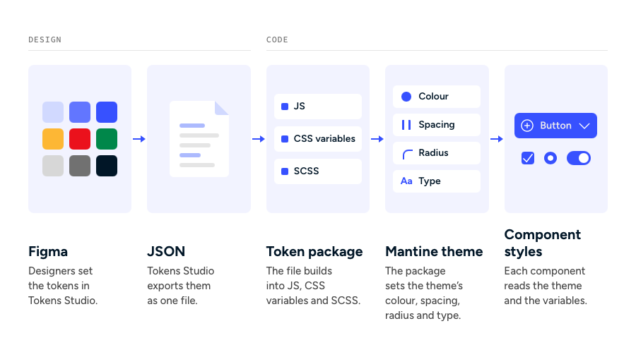
- Mantine, themed with Klue’s design tokens
- Tools
- Figma, Storybook, React Scanner
106
lines of CSS down from 542 on Button alone.
80%
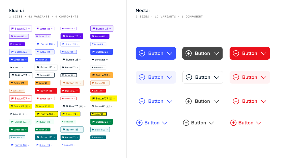
fewer button variants (from 63 → 12).
54%
fewer variants across the entire product.
The problem
Adopted, and worked around.
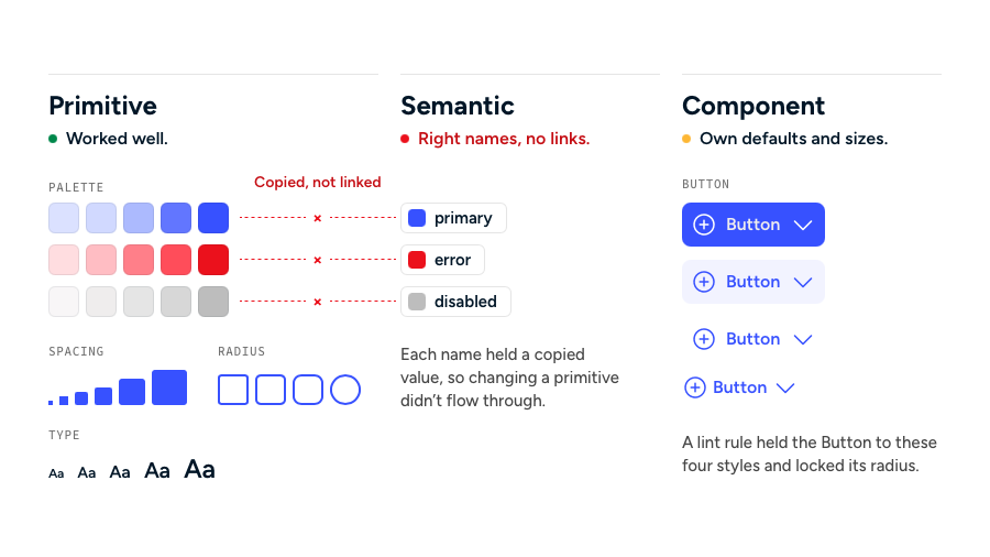
Klue’s design system, klue-ui, looked well adopted. Overrides and one-off components kept growing anyway.
The survey found two causes. Teams were pushed hard to ship, and klue-ui was too complicated to learn, so they built what they knew.
What I owned
Shared work, one direction.
I worked across all of it with the team, from the survey and research through design and shipped components, and kept nudging it toward fewer, clearer choices.
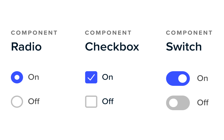
Radio, Checkbox and Switch. I built Nectar’s Radio, Checkbox and Switch, inside the structure the engineers set up.
-
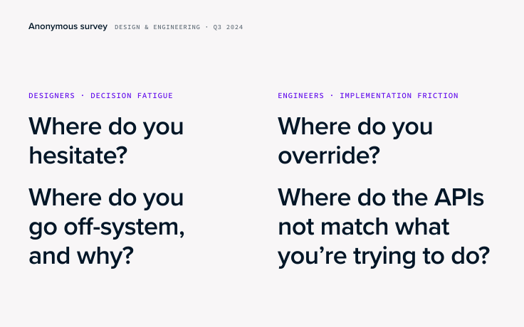
The survey.
I ran an anonymous survey of design and engineering with our design system evangelist, and we analysed the answers together.
-
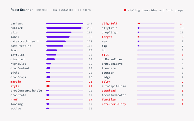
The code audit.
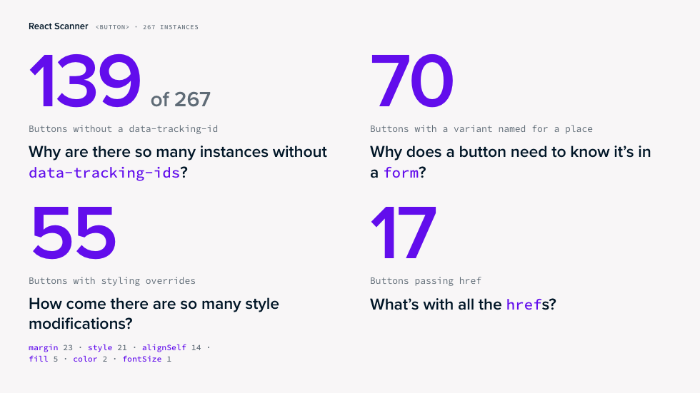
I audited the code with React Scanner and took the findings to the team as questions.
-
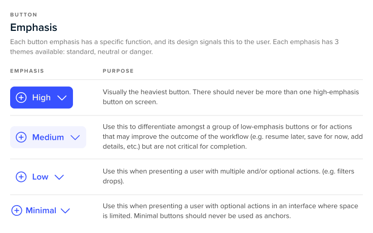
The Button model.
I worked out the purpose of each emphasis, defining how each should be used.
-
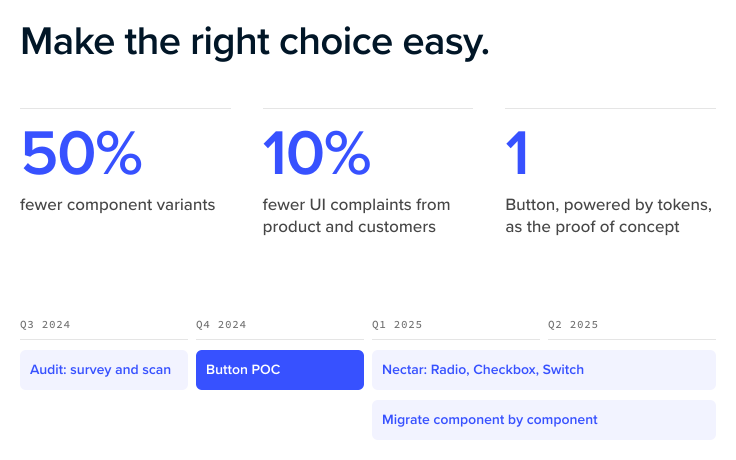
The OKRs and roadmap.
I reviewed the design system’s OKRs and roadmap.
-
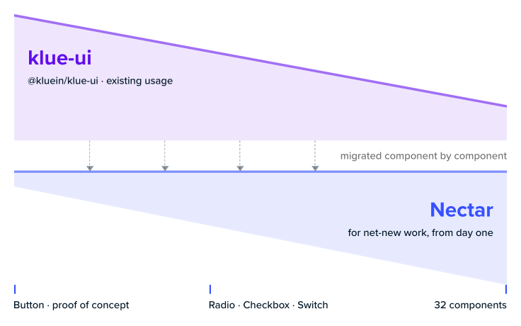
The migration plan.
I advised on the incremental plan: component by component, with no rewrite of the app.
-
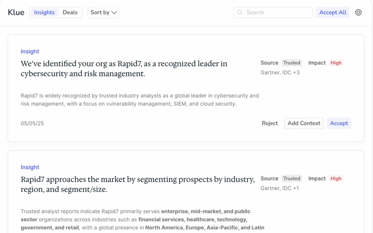
The prototypes.
I prototyped component interactions in code for the team, and built my own Klue prototypes on Nectar.
The solution
Make the right choice the easy choice.
Choosing a component should be quick and obvious for both designers and engineers. We chose to redesign both the look and feel as well as the underlying component library.

Proof of concept: Button. We cut variants, renamed each one, and introduced Mantine as the underlying library.
Underneath
From Grommet to Mantine.
The original design system was built on Grommet. Over the years it became heavily customized. To make things simpler, we chose to adopt Mantine as the foundation – a more mature system that needed far less customization.
Tough calls
Four calls shaped the system.
The Button first.
To show leadership a rebuild was worth it, we proved the approach on the most misused component first.
Beside klue-ui, not instead of it.
Engineering worried a new system meant rewriting the app. Nectar went in beside klue-ui: new work used it from the start, and existing screens moved over later.
Mantine, not more Grommet.
We weighed lots of options. One of our engineers pushed hard for Mantine, and it was a good call.
Named by intent, not by place.
A “form button” said where to use it. Standard at High emphasis says what it tells the user, anywhere in the product.
The outcome
Fewer variants, one Button.
Across the system, variants fell 54%. Engineering said components were faster to build, and customer complaints about the UI fell 10%.
Nectar became the library for new front-end work at Klue.
106
lines of CSS down from 542 on Button alone.
80%
fewer button variants (from 63 → 12).
54%
fewer variants across the entire product.
“Klue Nectar, coming soon.” The 46-second teaser from January 2025.
My take
You can’t train your way out of a hard system.
You have to make it simpler. klue-ui was too complicated to learn, so people rebuilt things by hand and drifted off-system.

Search design.