Search design
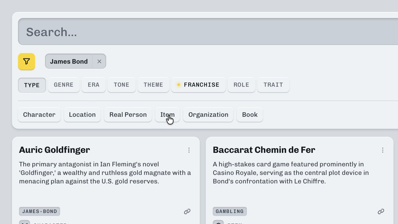
Everything on a competitor, from a single search.
A redesign of search for Klue, a platform where sales teams collect what they know about their competitors. Sellers look things up in it to learn what they're up against. I led the UI design and tested its behaviour in prototypes.

Project facts
- Role
- Design lead
- When
- Q4 20242
- Where
- Klue, a competitive intelligence platform
- Team
- Myself and a PM
- Delivered
- Figma files, prototypes and video walkthroughs
- Status
- Implemented
- Scope
- Search in Klue's web app
- Precedents
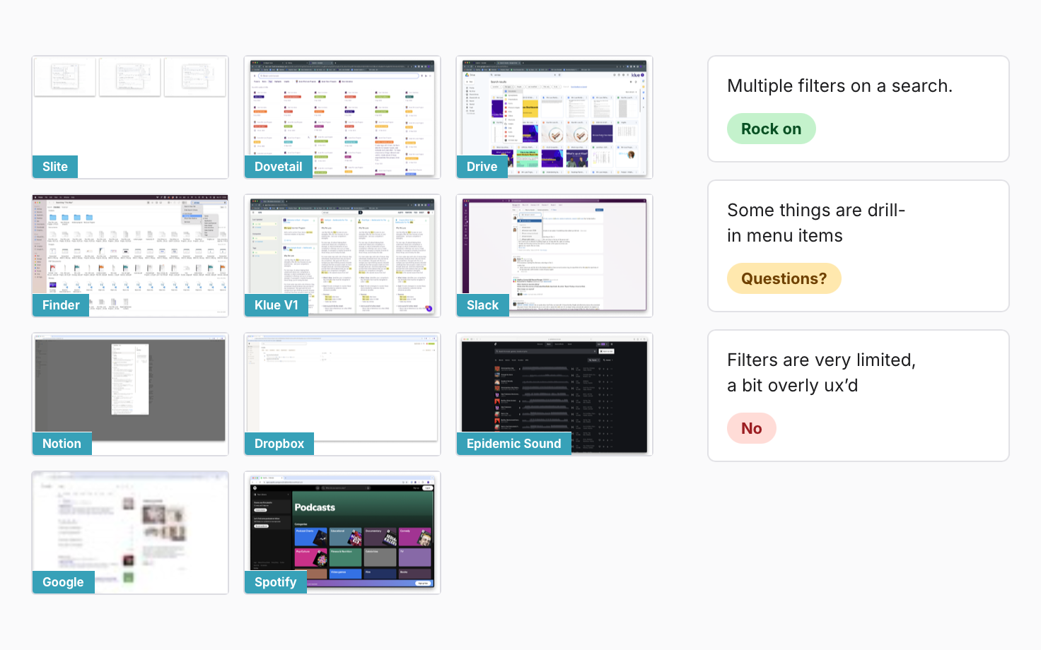
- Slite, Dovetail, Drive, Finder, Klue V1, Slack, Notion, Dropbox, Epidemic Sound, Google, Spotify
80%
of searches were for a company’s name, because no one knew what to search for.1
35
content types were in the product, but weren’t being surfaced.
1
consistent, easy-to-read layout for search results.
Get to know Search design.


The problem
Search hid what Klue knew.
The search experience was fragmented and confusing. It returned only one type of content, so users didn't know what to search for. Research showed roughly 80% of searches were for a company's name.1 We needed a way to reveal the depth of knowledge stored in a user's account.
- Single type.Results came back as one kind of object. The exception was the golden card, a special result that held only links: a stand-in for content search couldn't reach.
- Bespoke refinement.Refining results was inconsistent and cumbersome. Some drop-downs should have been toggles, some had tabs, some had drop-downs inside them, and even those patterns were duplicated.
- Visual variations were wide.Results were visually inconsistent: their hierarchy came from how each author formatted them. With no results, search returned something that looked like a result.
- Different scanning behaviour.The layout and design changed with where you were when you searched, so every page was read a different way.

The old search. Fragments of cards in a masonry wall, the golden card of links, and a panel of filter widgets.
What I owned
From the first audit to the prototypes.
I led the UI design and defined result anatomy, introduced a reusable component, established interaction rules, and validated behaviour through interactive prototypes.
-
The audit.
I studied search in eleven precedents, Klue's own first version among them, and marked what worked and what didn't.
-
The content mapping.
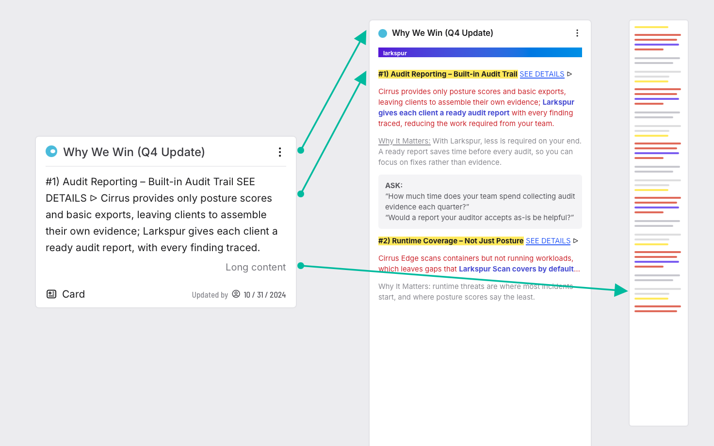
I mapped Klue's content into the card in 36 frames, and wrote down the rules where it broke.
-
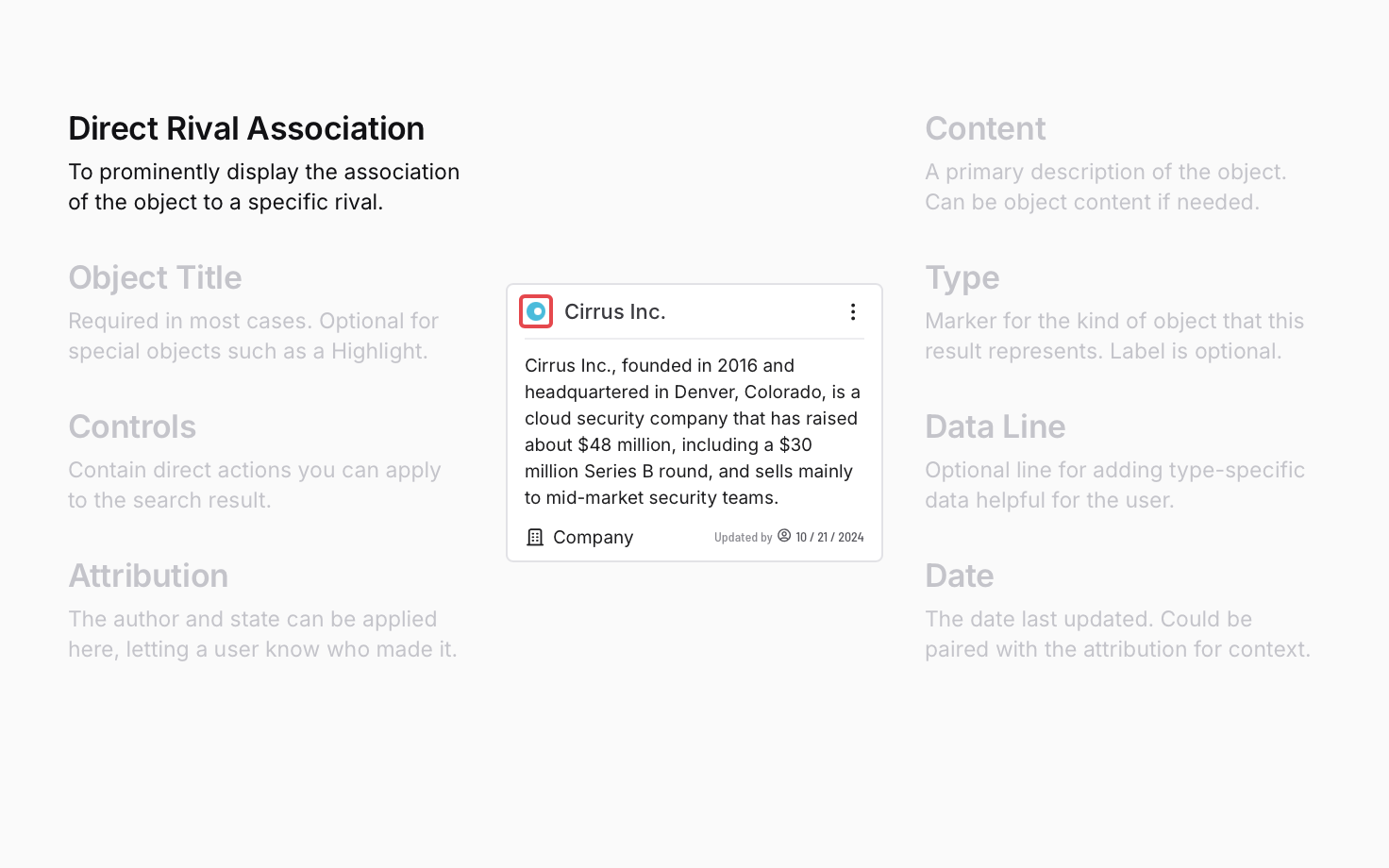
The result anatomy.
I defined the eight parts of a result, from the fields every kind of object had in common.
-
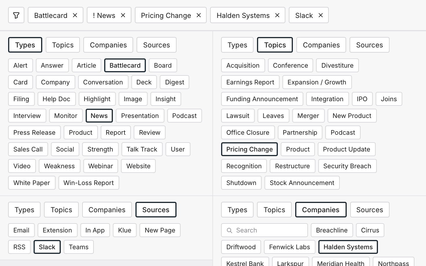
The filters.
I designed four filter sets, for types, topics, companies and sources, with single, multiple and Not selections.
-
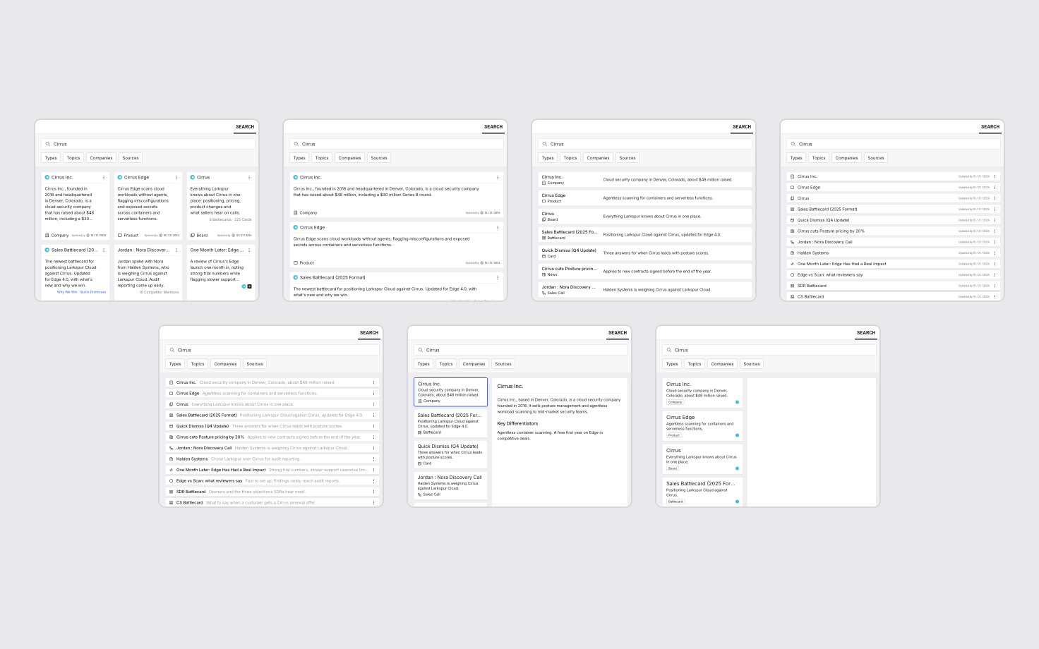
The layouts.
I drew seven densities, from a grid of cards to a single line, and a list beside a preview.
-
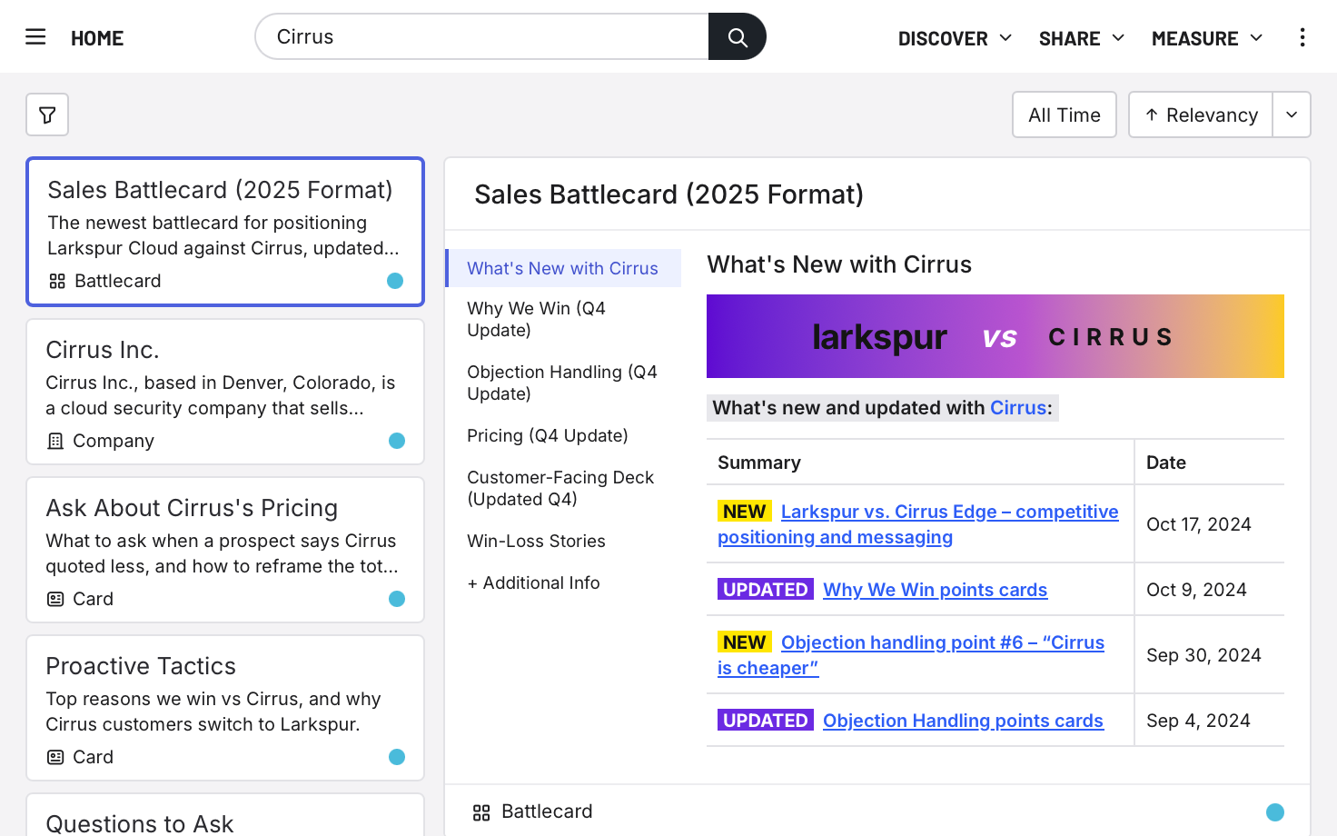
The component.
I put one search in the global nav, with the same results and preview wherever you opened it.
-
The prototypes.
I broke the work into tickets, one concept at a time, and validated the behaviour in interactive and video prototypes.


The solution
Know what a result is at a glance.
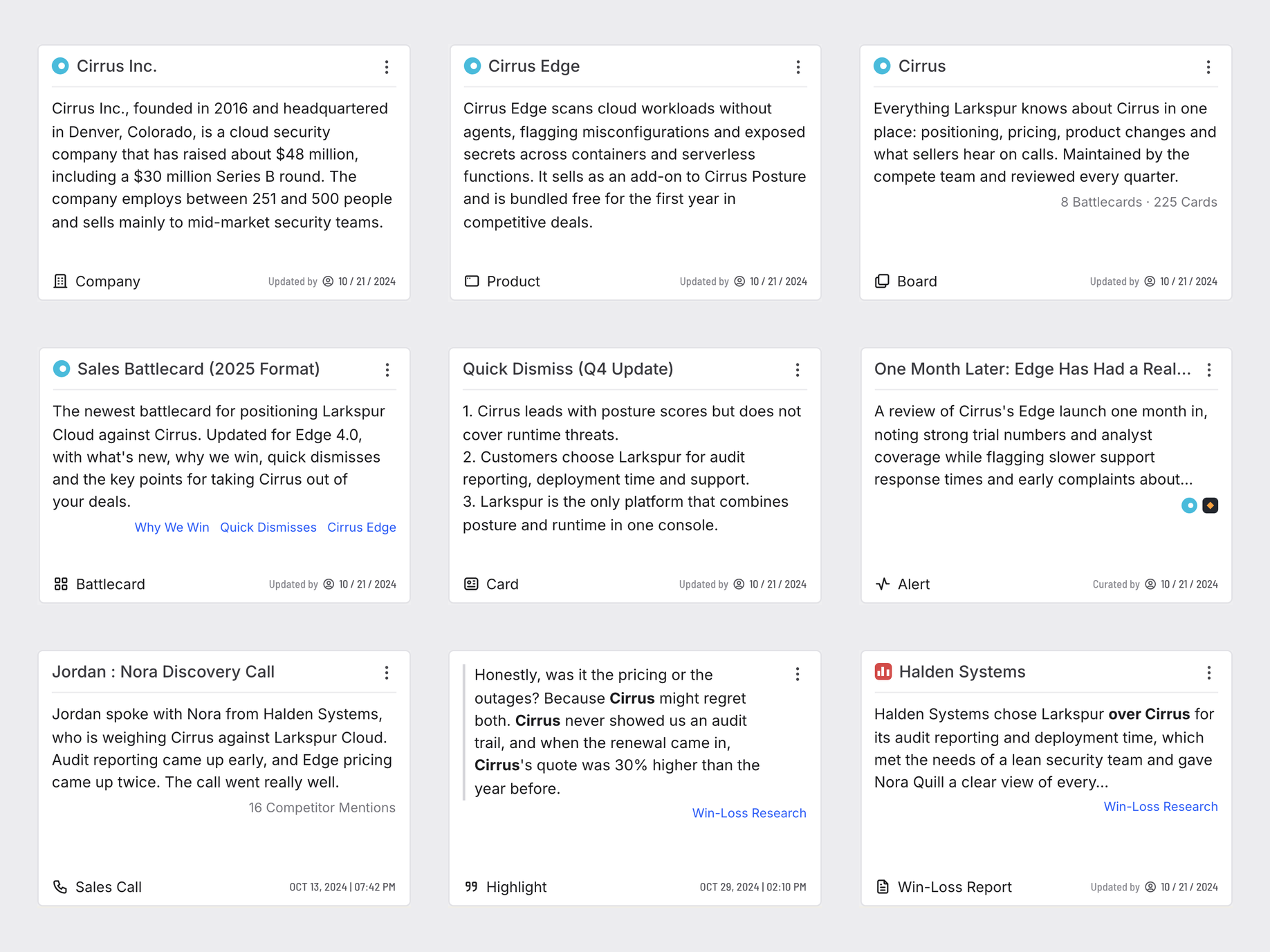
I gave every kind of content the same card, so you'd read a result the same way whatever it was. If every result looked different, a seller would spend the search working out the page instead of the competitor. The design came down to four key elements, each a job a seller needed done.

The parts of the card. Dashed lines mark the optional ones.
Underneath, part one: the content model
Shaped by the legacy system.
It had to fit the legacy system: keep its tagging, respect each user's permissions and normalize content for indexing. The data already knew far more than search showed. I spent time mapping the current content model to basic, readable and consistent types that our users would understand at a glance.

From system values to seller words. I mapped technical definitions to common language.
Underneath, part two: the mapping
Every object, mapped into one card.
The card came from the objects it had to show. I took the fields every kind of object had in common: a link, a title and a description, with a rival and a line of data as options. I adhered to the existing content, while leaving flexible space for customization.

A card mapped to its object. The new card holds everything the legacy design did.
Tough calls
Four calls shaped the design.
Inline filters.
I wanted search that felt fast and simple. Inline filters under the search bar were ideal.
Short cards.
I capped the card's height because scanning results was more important than reading in place.
The web app only.
Search in Klue's web app, on a 13-inch laptop screen. Everything else was out of scope.
A vision, shipped as smaller features.
I designed all of search at once, so it had to hold together as a system and still come apart into tickets.
The outcome
It set where Klue's search went next.
Simplified search was more consistent, legible and easy. Klue started putting it into production, from my designs and video prototypes. It hadn't launched by the time I left, but the result card and the filters set the direction of Klue's search for 2025.
Later, I built the redesign as a working search80%
of searches were for a company’s name, because no one knew what to search for.1
35
content types were in the product, but weren’t being surfaced.
1
consistent, easy-to-read layout for search results.
My take
Better indexing, less surface.
My biggest takeaways were that this project emphasized the need for far better indexing throughout the product, as well as the benefit of reducing product surface/complexity.
Questions? Answers.
-
Why are the names made up?
The real screens hold Klue’s customers, competitors and content. The pictures are redrawn from my design files with an invented cast: Larkspur Security, its seller, a buyer at Halden Systems, and the competitors Cirrus and Breachline.
-
Where did it start?
With a sketch. The product manager had drawn a new results page to put in front of users in interviews, and I rebuilt it as a comp. My note on it said the real explorations would need precedent research and design proposals that consider all options for improving search.
-
What did you look at first?
As many variations as I could find, to feel the direction things were going: search in Slite, Dovetail, Drive, Finder, Klue V1, Slack, Notion, Dropbox, Epidemic Sound, Google and Spotify. I marked what worked and what didn't: a drop-down over a drop-down, a filter with 200 options, newest and oldest as two controls instead of one button.
-
Who found the 80%?
The product manager who owned the search epic, in Klue's search data. My part was the design built on it.1

Search prototype.