 The wall
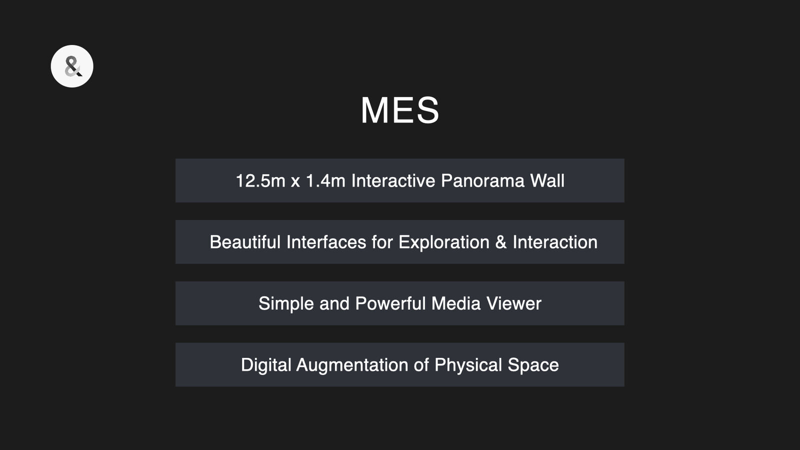
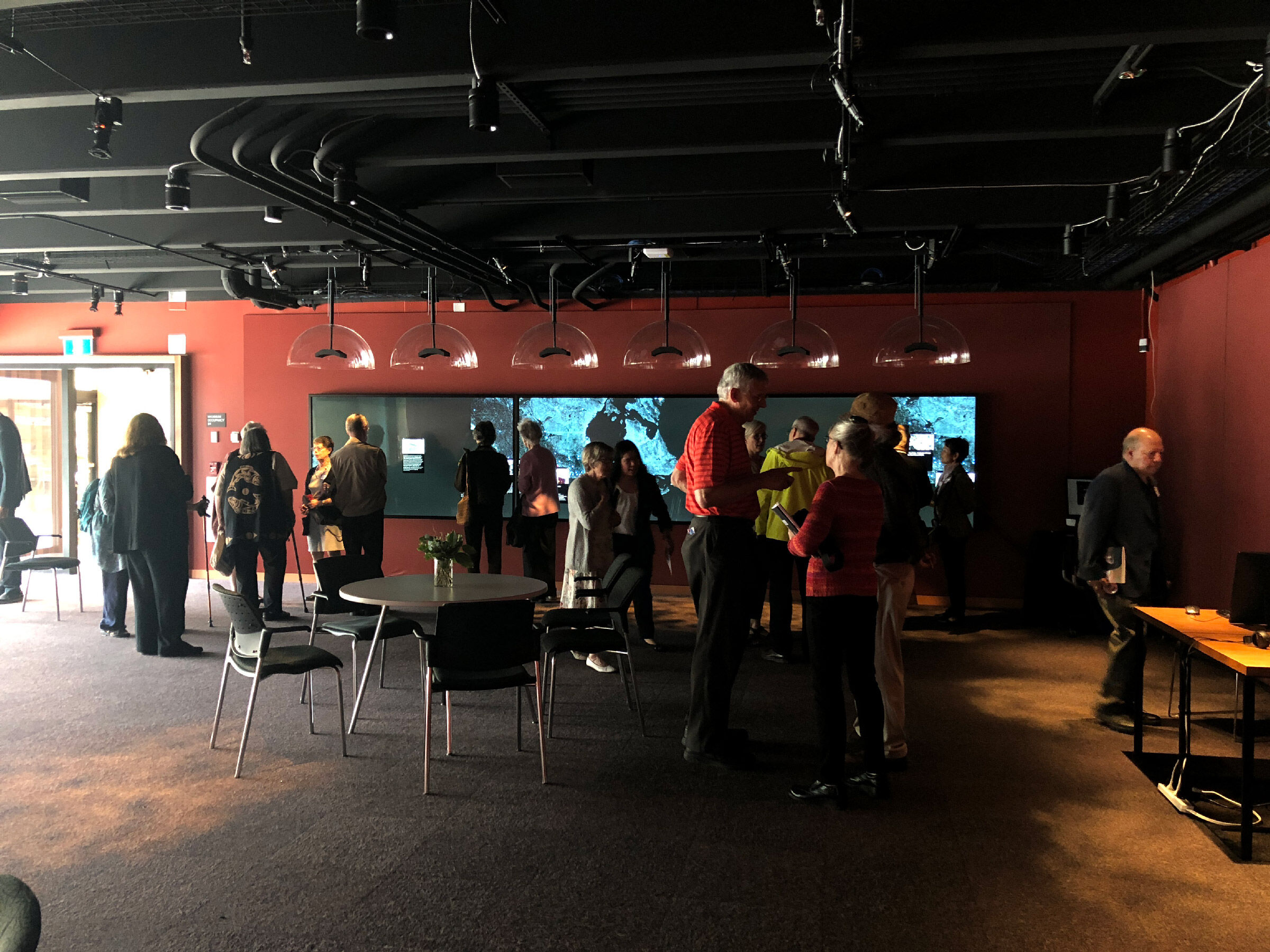
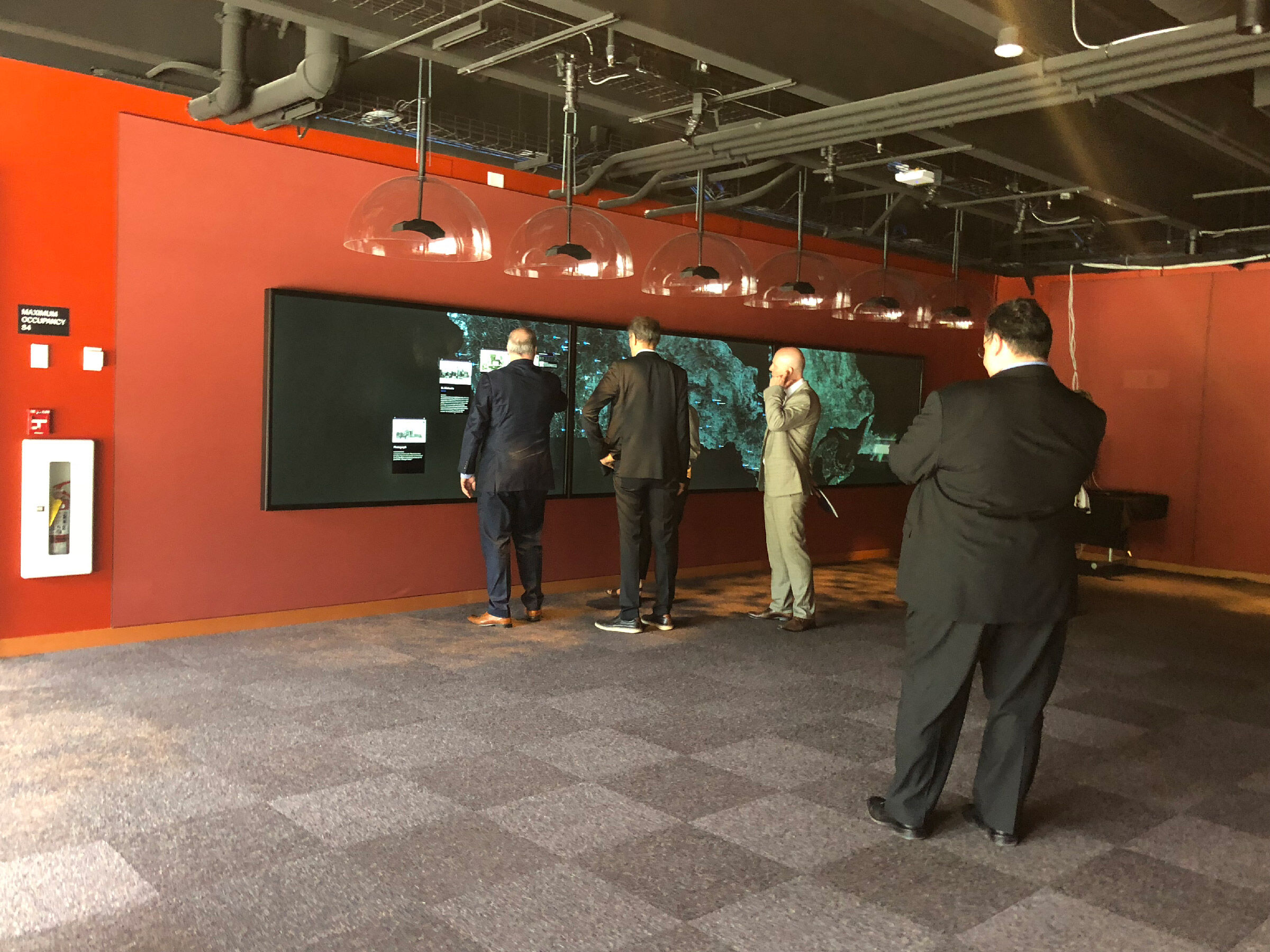
A touch wall on the history of residential schools, at UBC.
Visitors explore the history and ongoing legacy of residential schools in Canada by map, timeline, theme and record.
Project facts
- Role
- Creative director, design lead
- When
- 2017 to 20181
- Where
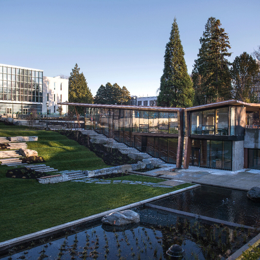
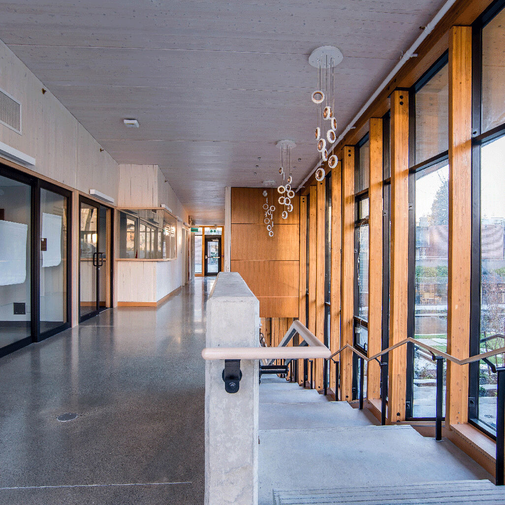
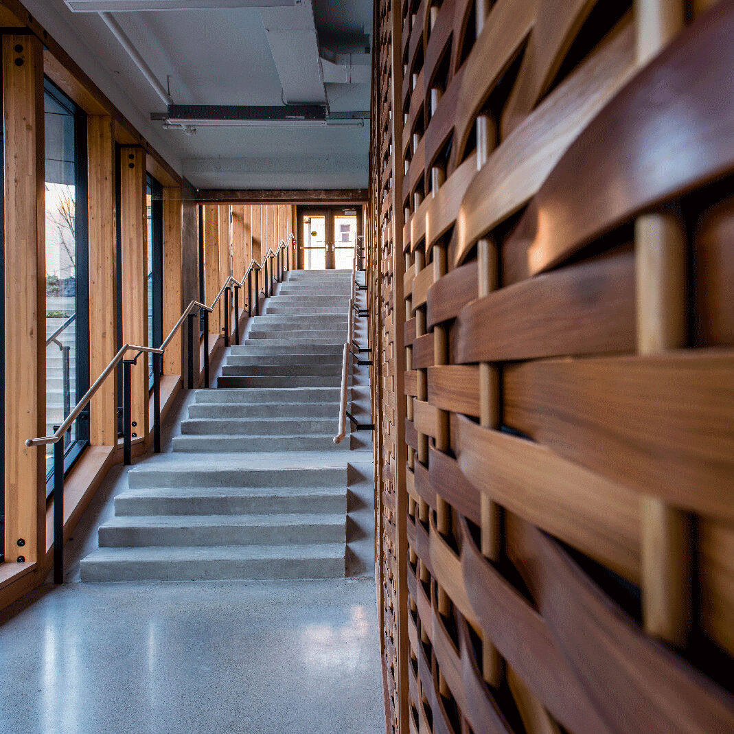
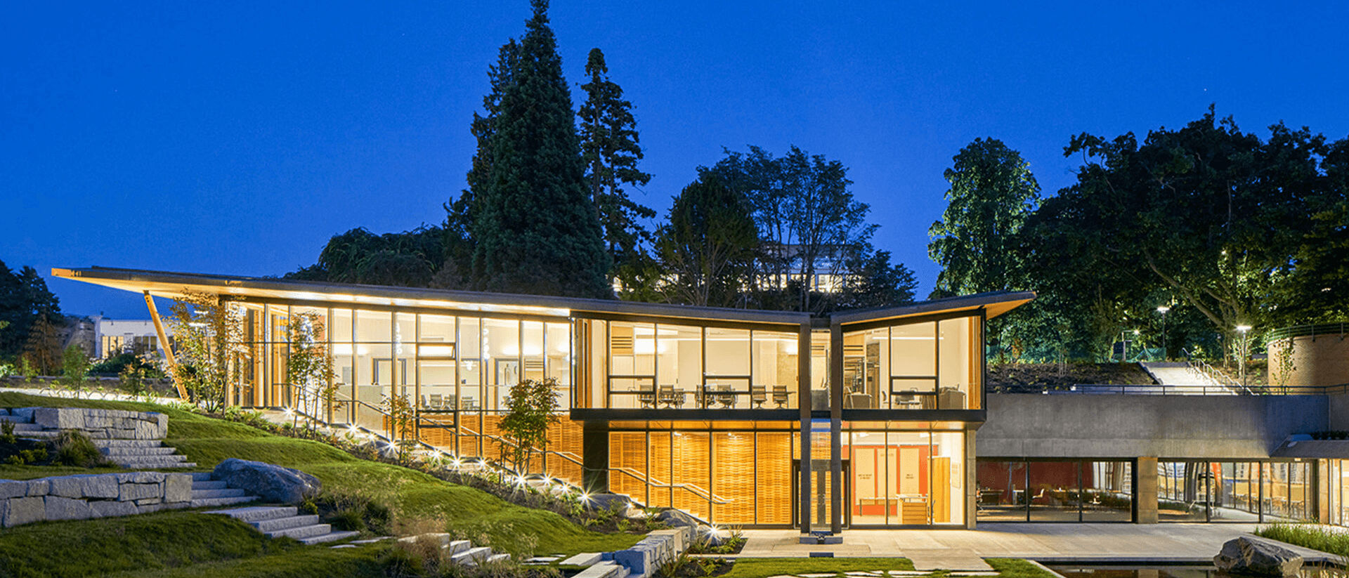
- Indian Residential School History and Dialogue Centre, UBC
- Team
- 132
- Built
- Three 100-inch 4K touch screens, one iMac Pro3
- Underneath
- Mac Gestures, our own multi-touch framework for macOS
- Sound
- 6-channel audio. Voices fade between speakers based on the player's position.
- Awards
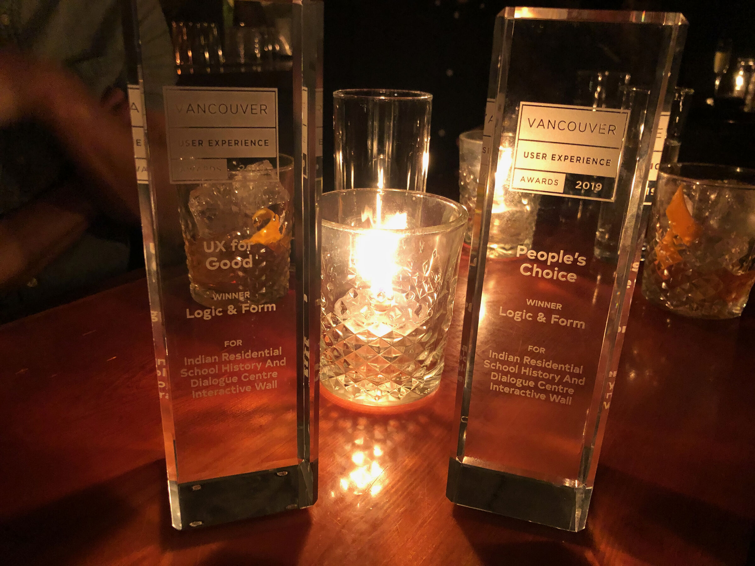
- UX for Good and People's Choice4
Get to know the wall.
The problem
Some visitors lived this history. Most had never been taught it.
The Centre didn't want a guided exhibit. It wanted visitors to work through the records, testimony and data themselves, and reach their own conclusions. The wall had to serve Survivors and their families alongside students and the public, handle material that could be traumatic, and run on a records system being built at the same time.5 The director's test: a visitor learns something new within 30 seconds.
What I owned
Creative director, from the pitch to the opening.
-
The studio.
I ran Logic&Form, the studio that made it, and led design, engineering and research.
-
The direction.
I held every decision to the director's goal: learn something new in 30 seconds.
-
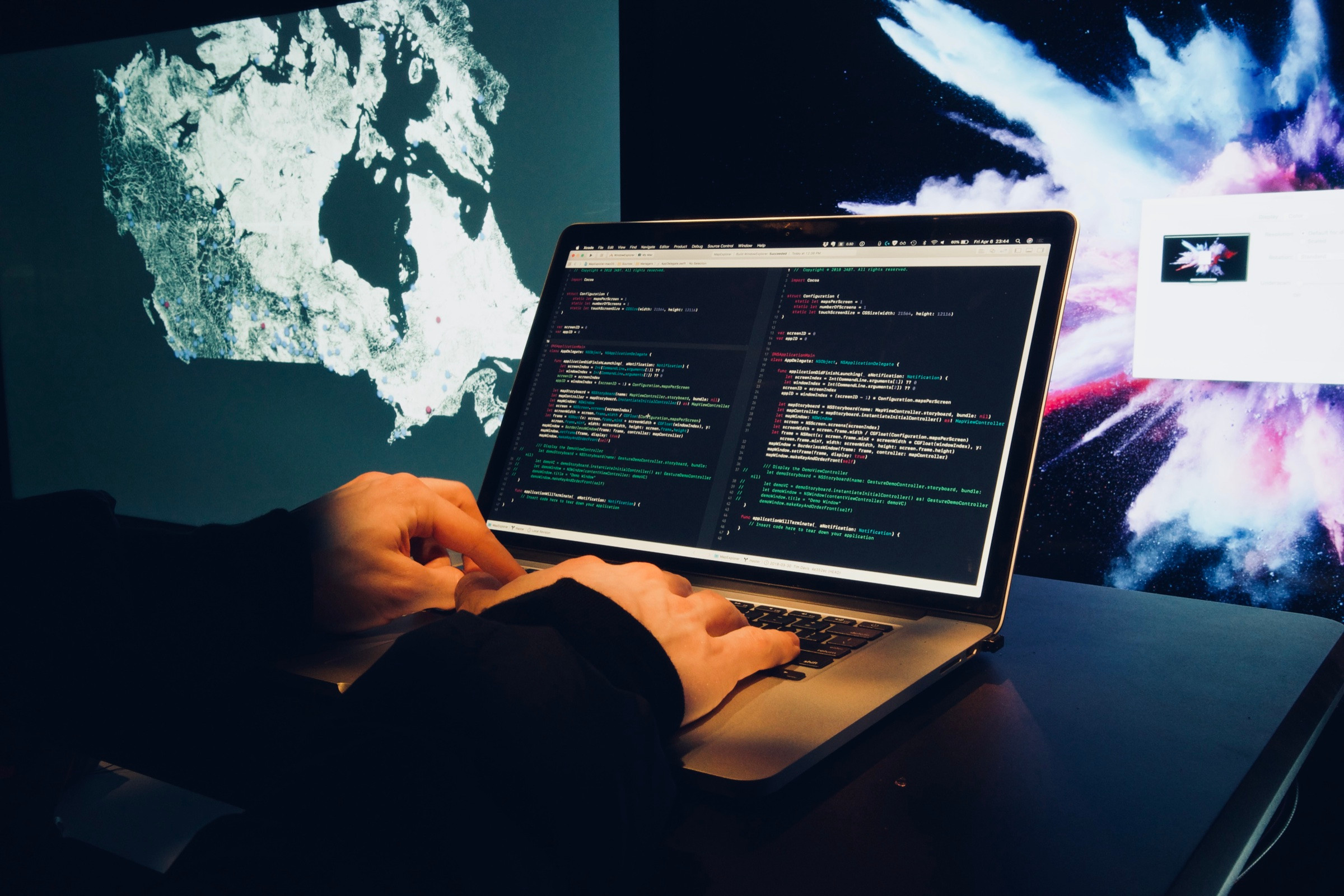
The finish.
I sketched or spoke an idea, the engineers built it, then I came in and polished the experience.
The solution
Hands on the history, not on a screen.
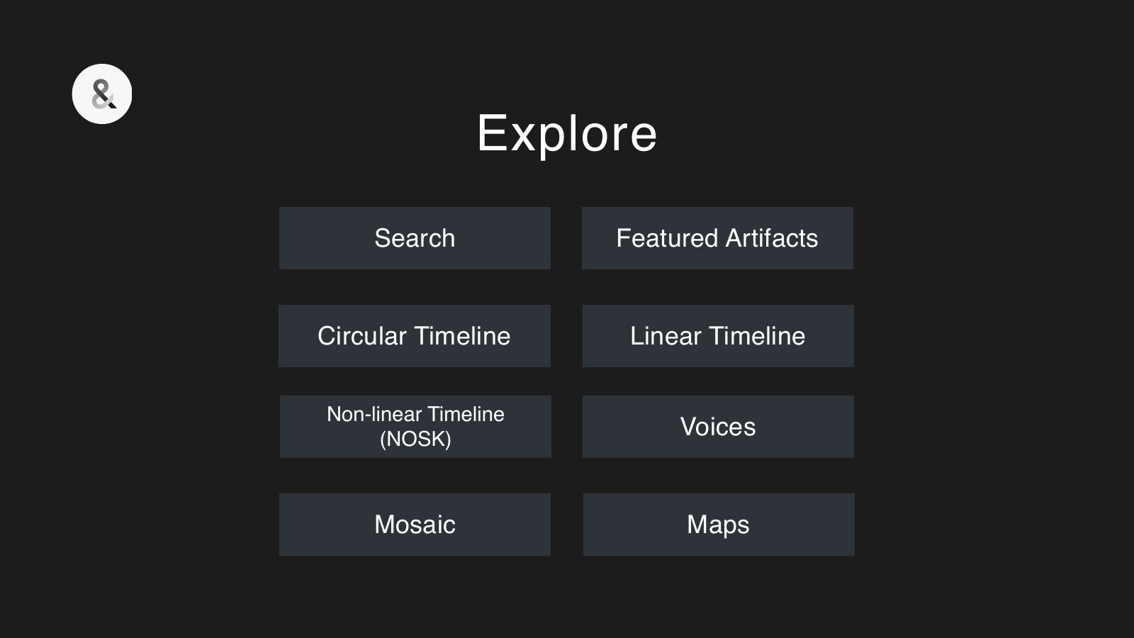
No one standing at the wall should ever feel they're wrestling with it. It's about the records: the schools, the photographs, the people in them, and finding your way through. Four ways in, so each person finds their own.
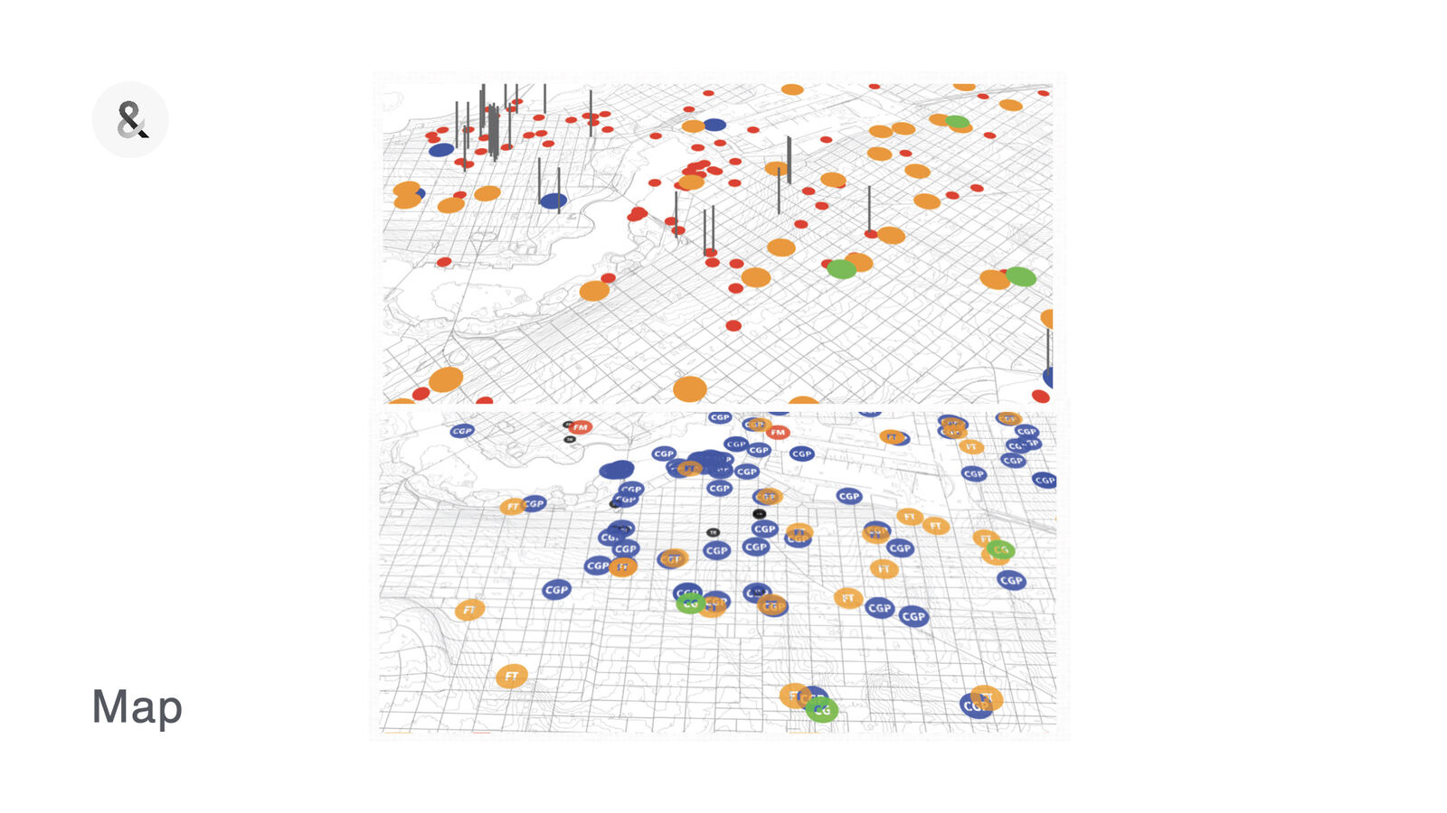
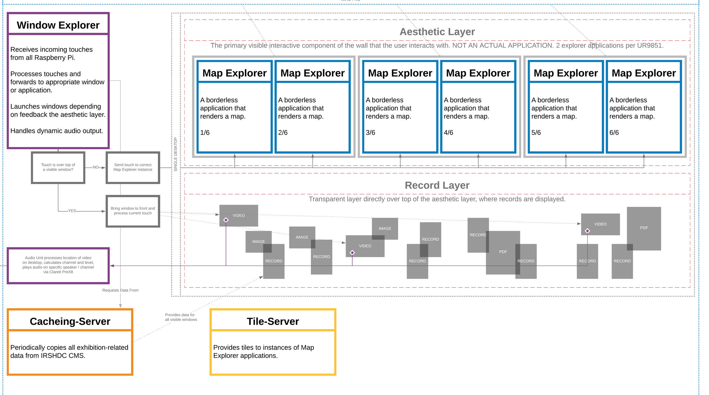
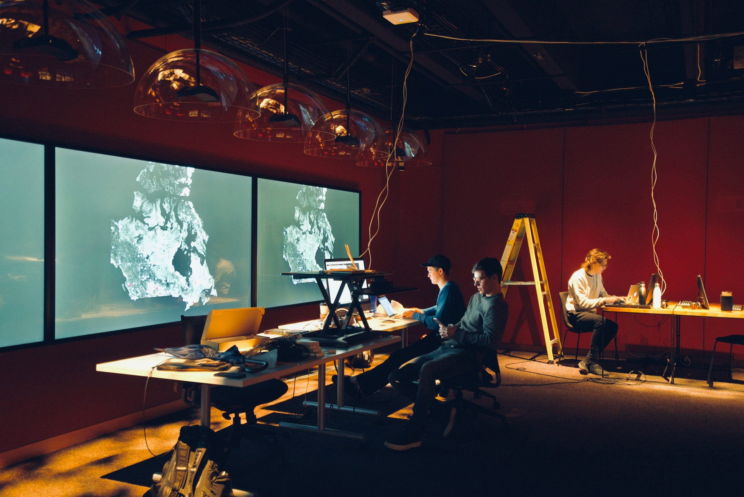
The Map interface. Canada, with the schools pinned where they stood. Pinch to zoom, pan to move, tap a pin to open its record.
Records. Every record opens as a window: its photographs, documents and related items, a tap away.
Timeline. Schools, events and hearings by date. It slides up and down to meet a visitor's height.
Themes. Drag one and it bumps into the others. Tap it and its records fly in.
Underneath
Everyone expects multi-touch. macOS had no such thing.
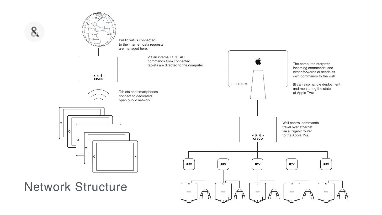
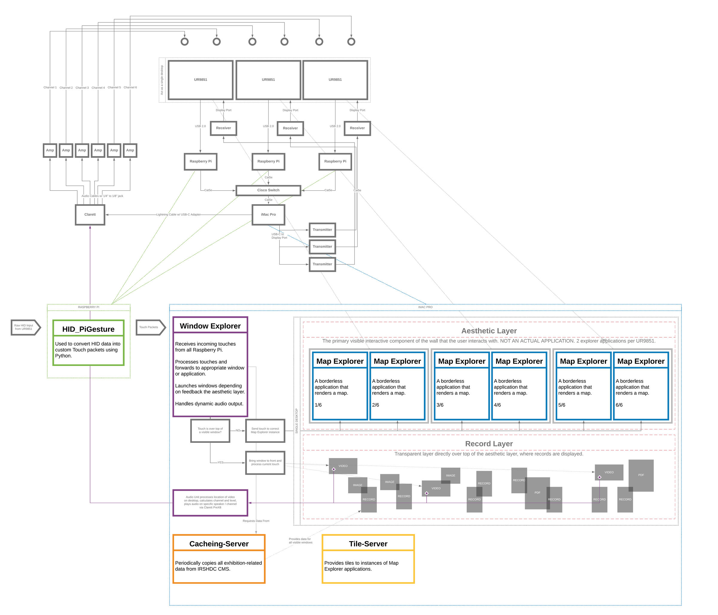
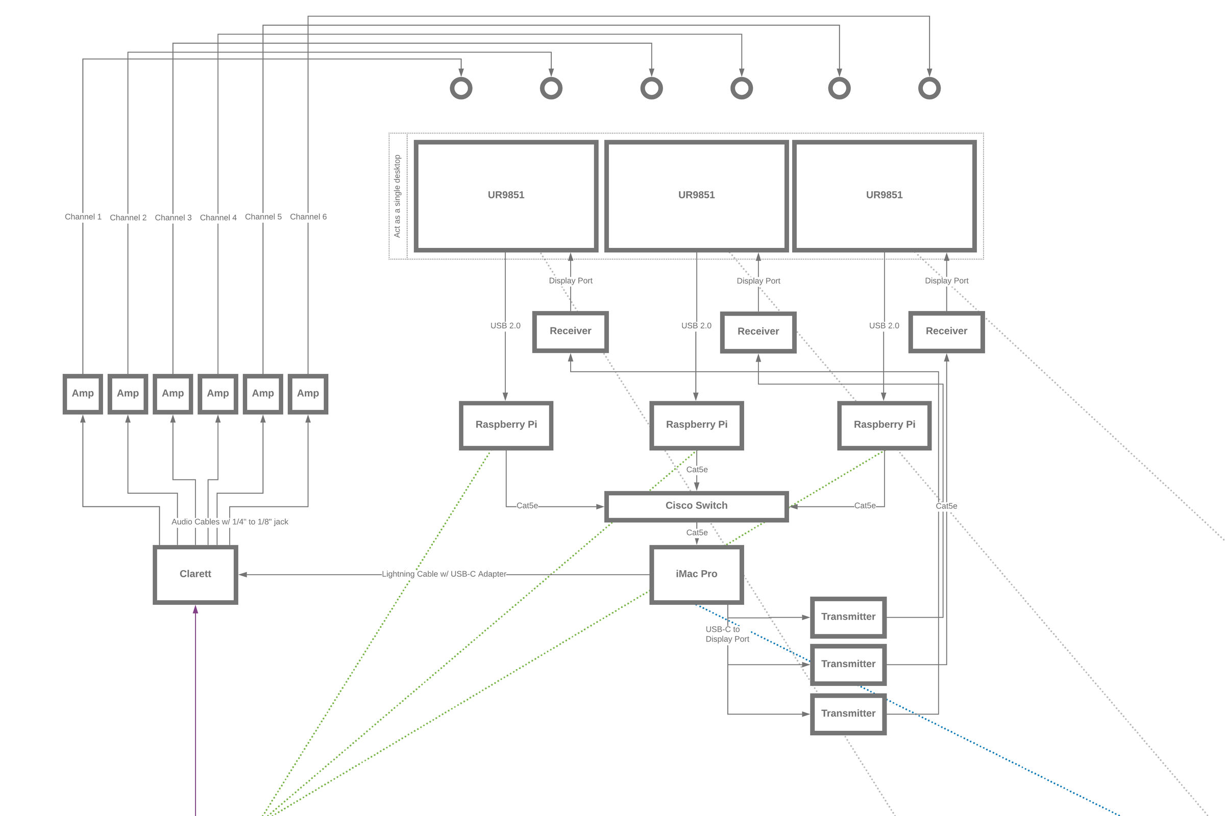
People would walk up and touch it like any touch screen. But the screens only sent raw touches, and nothing on the Mac turned them into gestures. So we built Mac Gestures, a multi-touch framework for macOS. A Raspberry Pi behind each screen passed every touch to one iMac Pro, fast enough that no one would notice. That had to be in place to make the rest magical.
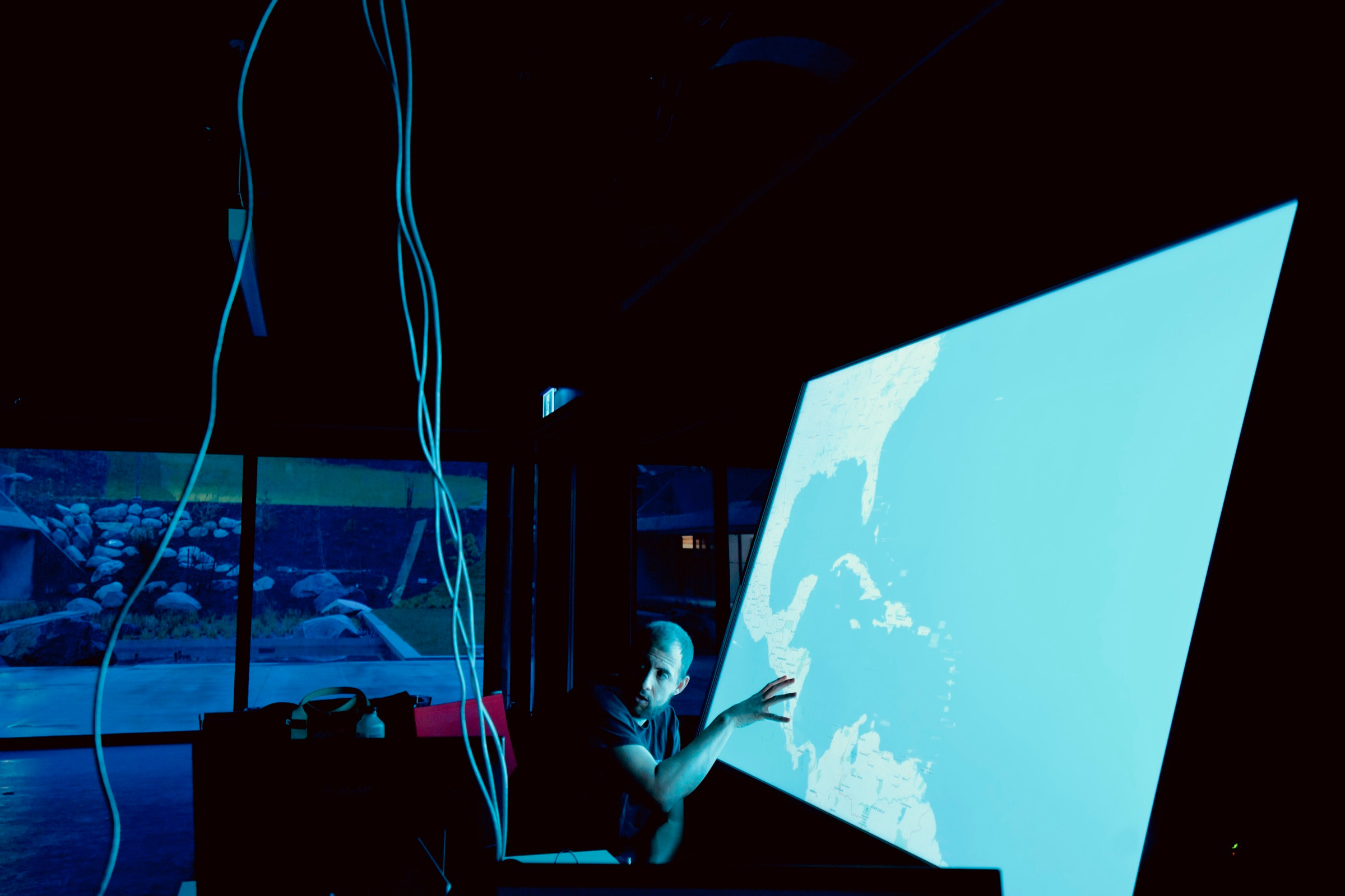
Proof of concept. We needed to prove we could get a true multi-touch experience on macOS. This first test showed it was possible.
-
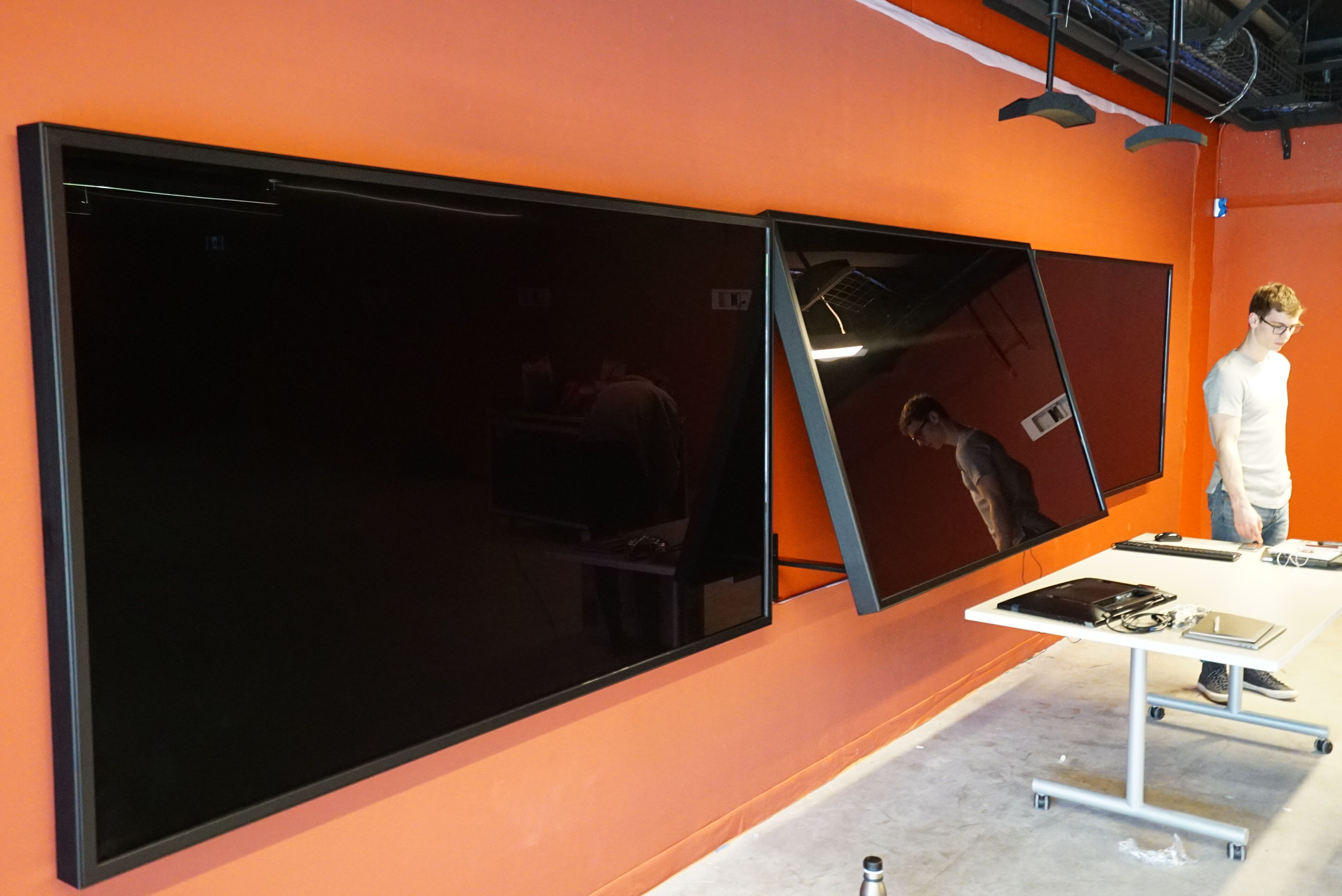
Three 100-inch 4K touch screens.
Hung in March 2018, each taking up to 32 touches at once.
-
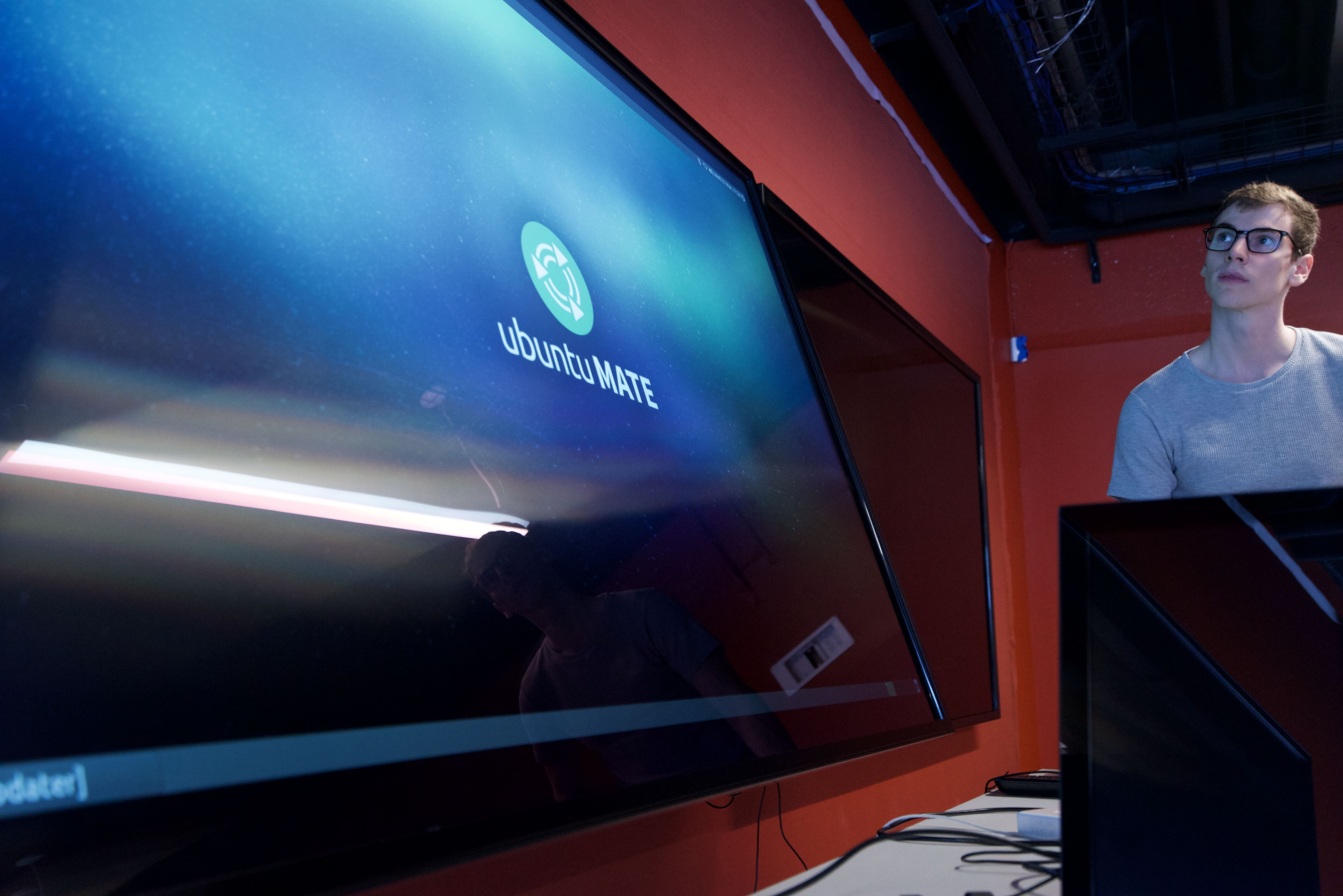
A small computer behind each screen.
A Raspberry Pi turns raw touches into packets for the Mac.
-
Several hands at once.
An early test of dividing the screen into multiple sessions.
-
Six sessions, several people in each.
The map and timeline divide, so visitors can work side by side.
-
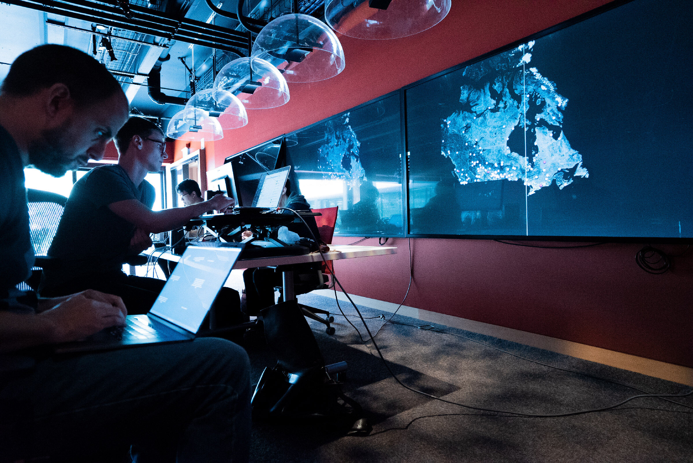
Built in the room.
The team designed, built and tested on the screens themselves.
-
Critical performance tests.
One iMac Pro drives all three screens. It had to be fast enough to handle everything.
Tough calls
Nothing could compete with the content.
We explored a wide range of interfaces, then landed on an interactive video wall. We cut anything that competed with the content, like light mode. A screen you stand in front of shouldn't blast light in your eyes.
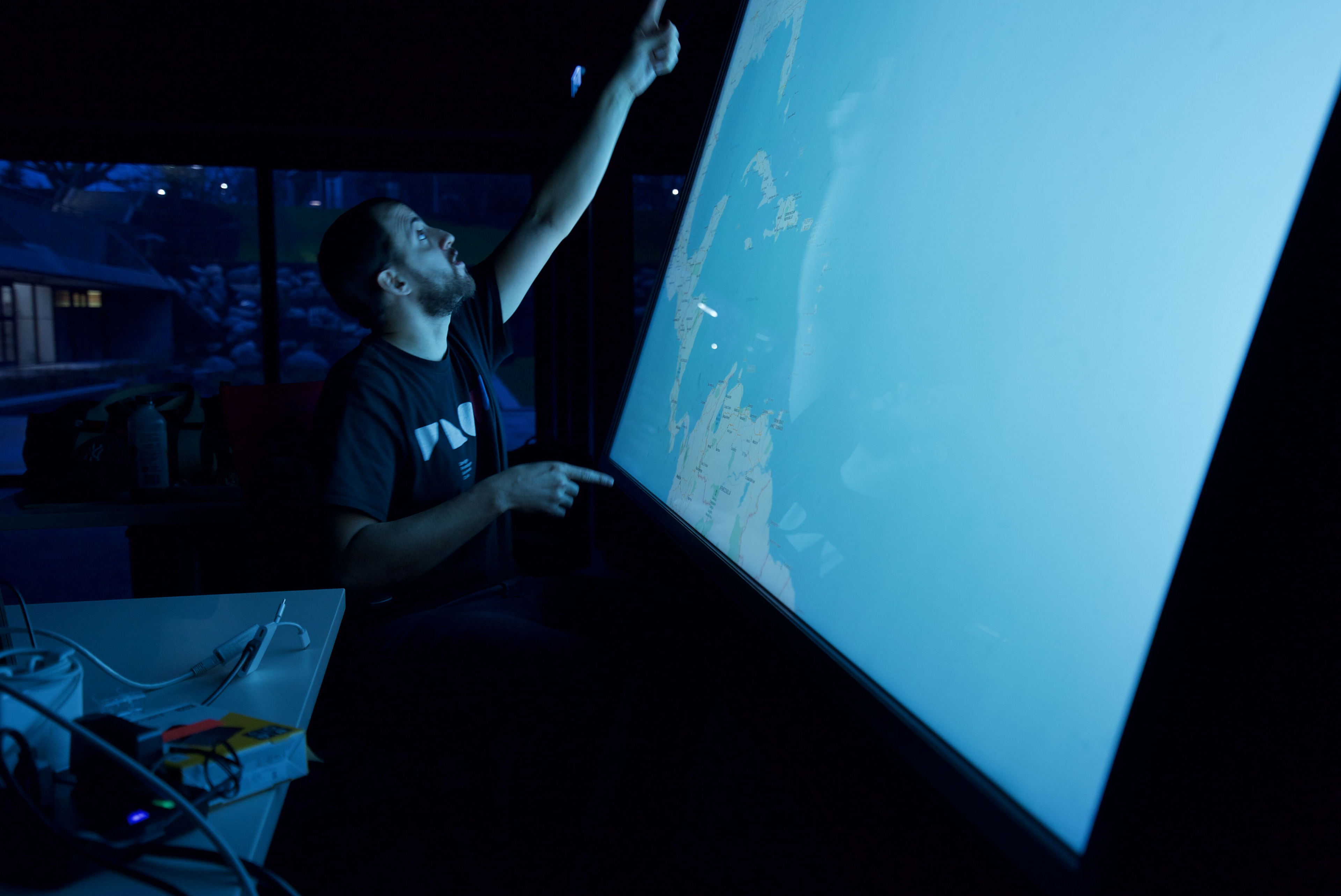 Testing
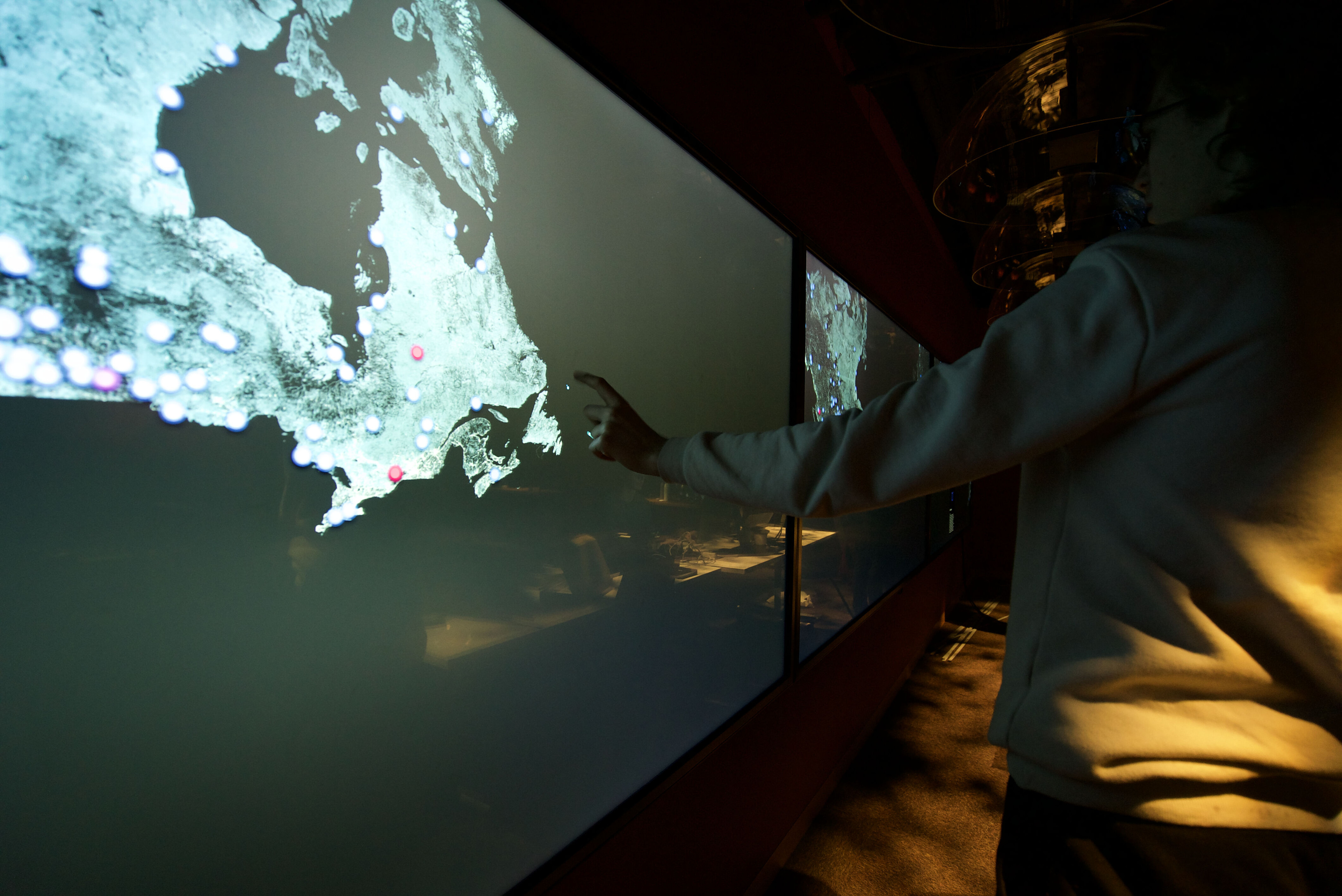 Shipped
-
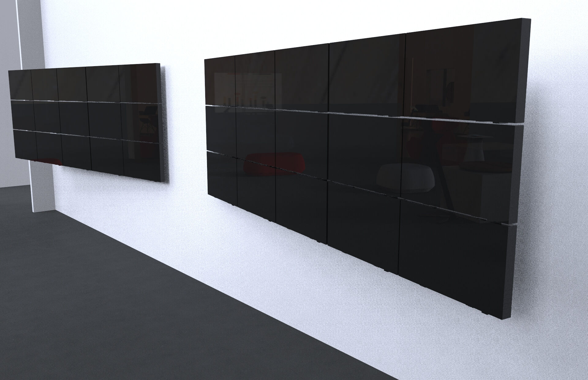
Lots of concepts were cut.
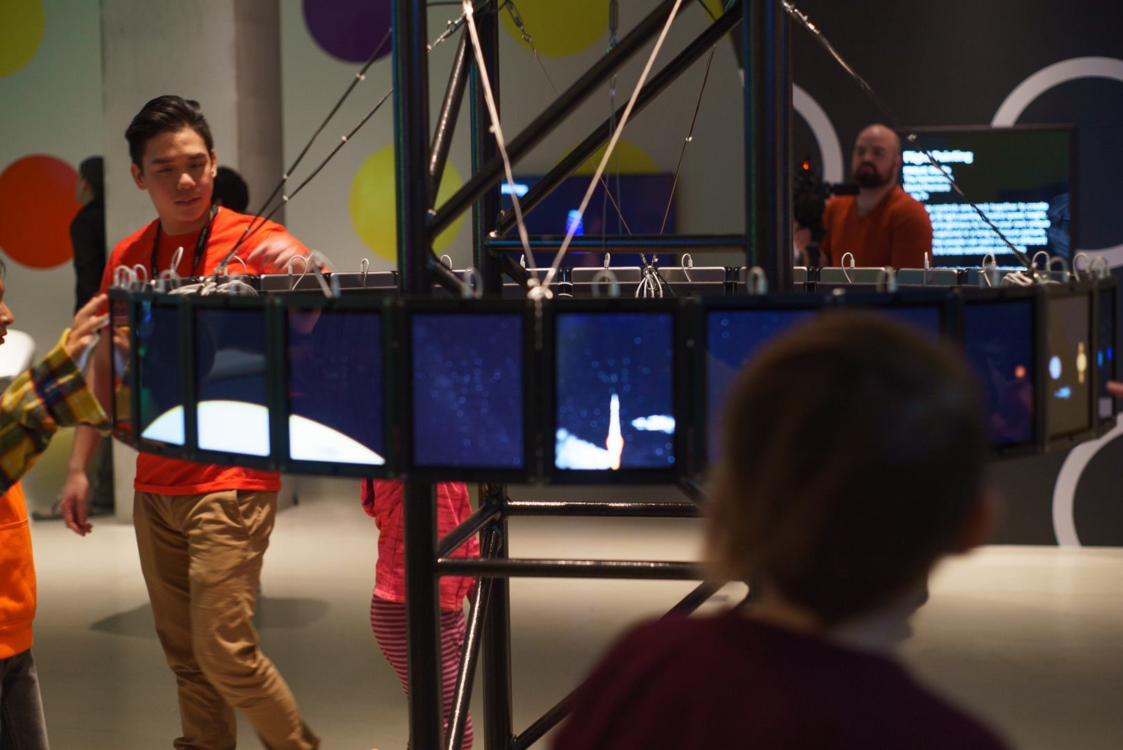
We had envisioned other setups, like these walls made of smaller multi-touch screens.
-
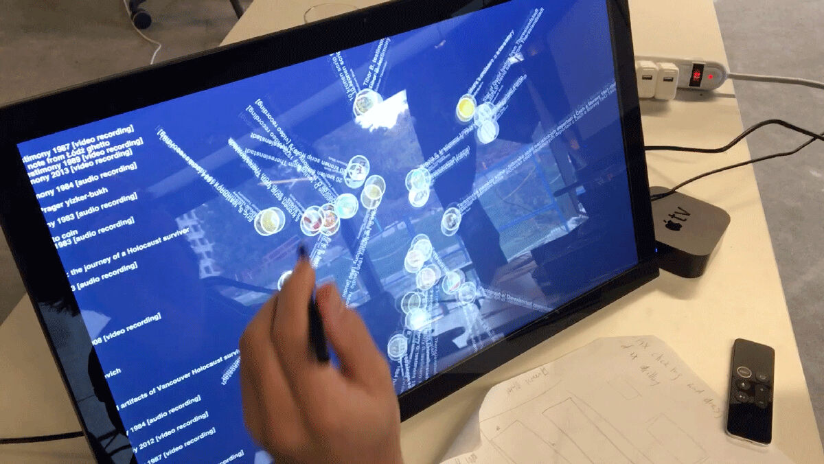
Cutting-edge explorations.
Beautiful interactions pushed the boundaries, but most would have been too brittle or kitschy.
-
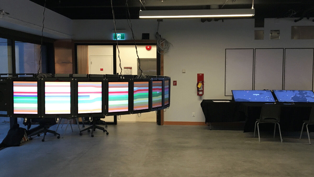
M/O, repurposed.
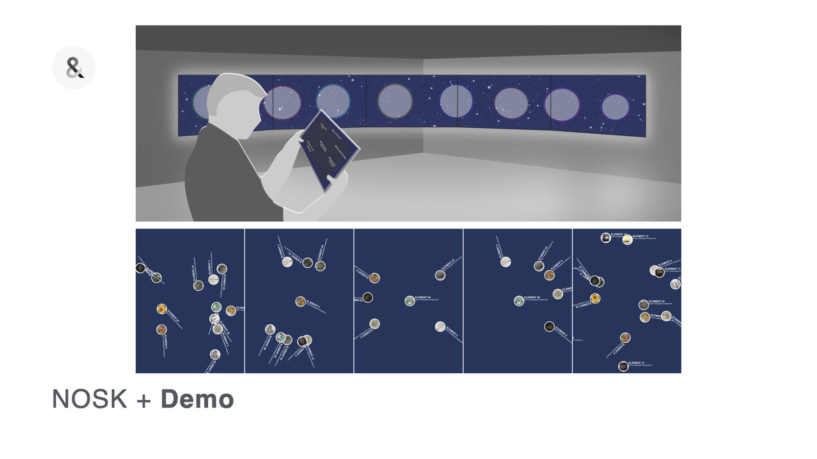
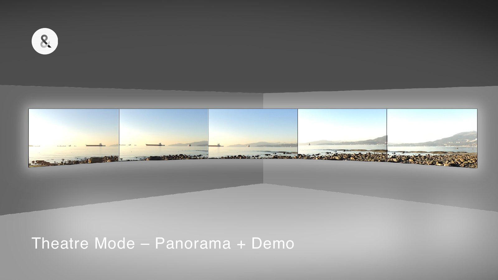
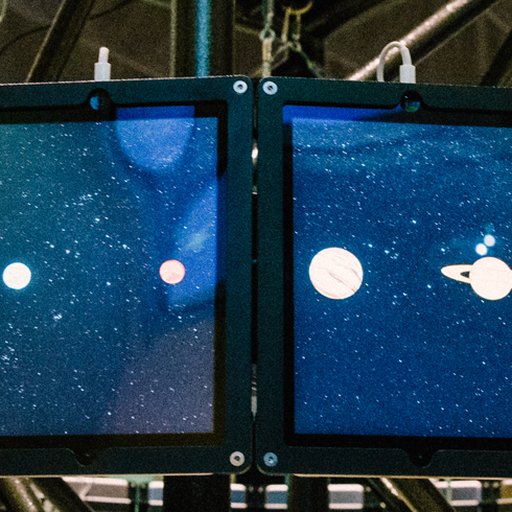
Its ring of screens ran a custom timeline for demo week.
-
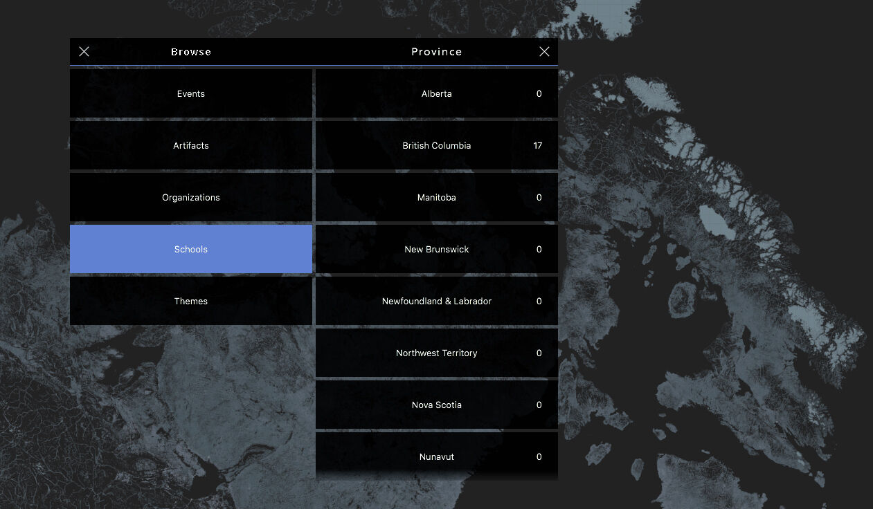
Information density.
At 100 inches a 4K screen's resolution isn't very high, which limited how much information we could put on screen.
-
What the map would show.
Shorelines, roads, snow and ice, each tried as a layer.
-
Speed and feeling.
We tested all kinds of physics and timings across the interface to get the feeling right.
The impact
People stayed, and told their stories.
Installations usually hold people for a minute. People stayed fifteen, twenty minutes, finding pictures of themselves and telling stories.
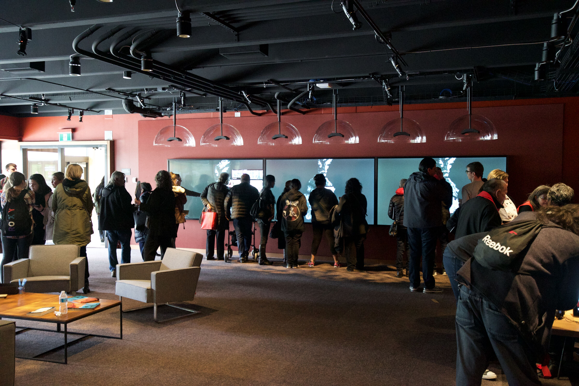
Opening day. We launched an alpha on the day the Centre opened, to a crowd of over 1,000 people.
“This is exactly what I had envisioned.”Linc Kesler, who led the Centre's founding at UBC
-
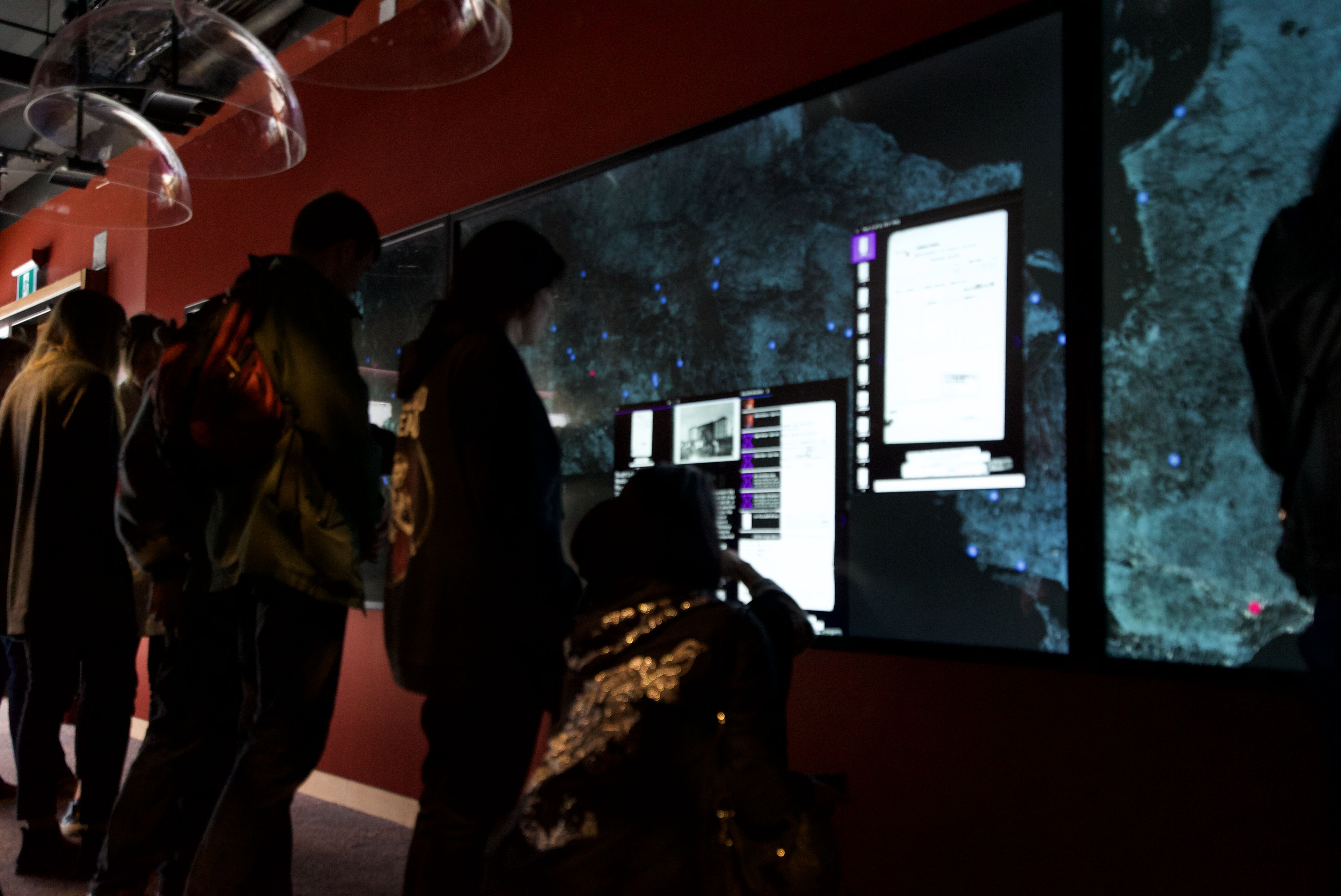
One record at a time.
-
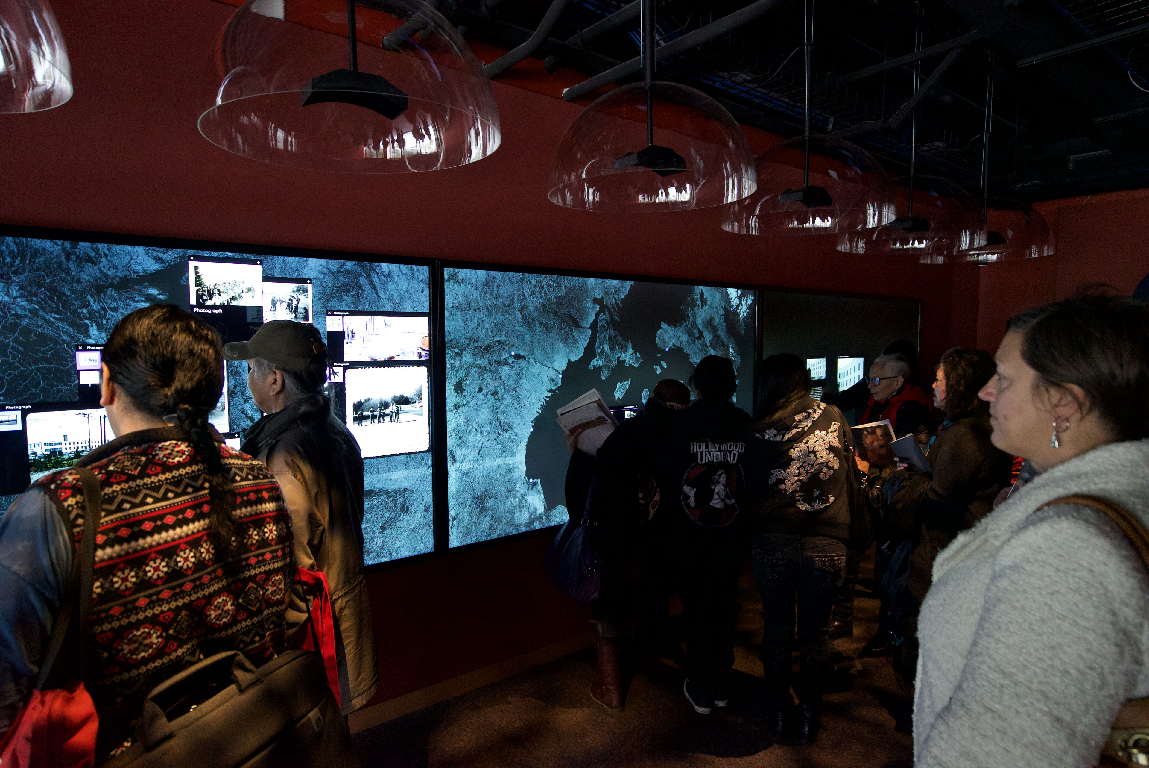
Records open across the wall.
-
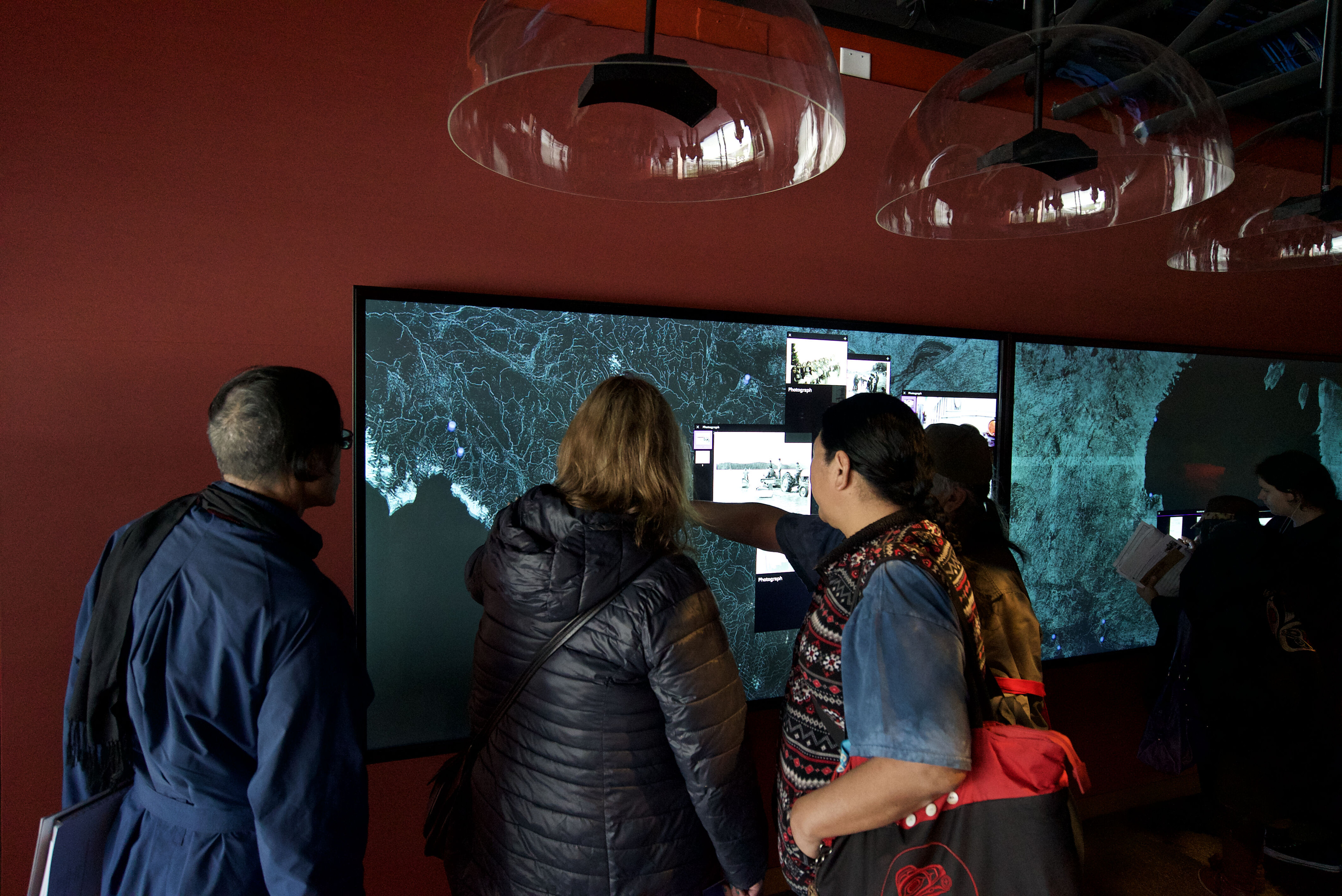
Showing someone else.
-
It launched as an alpha.
It wasn't fully working on Friday. By Monday or Tuesday, it was.
-
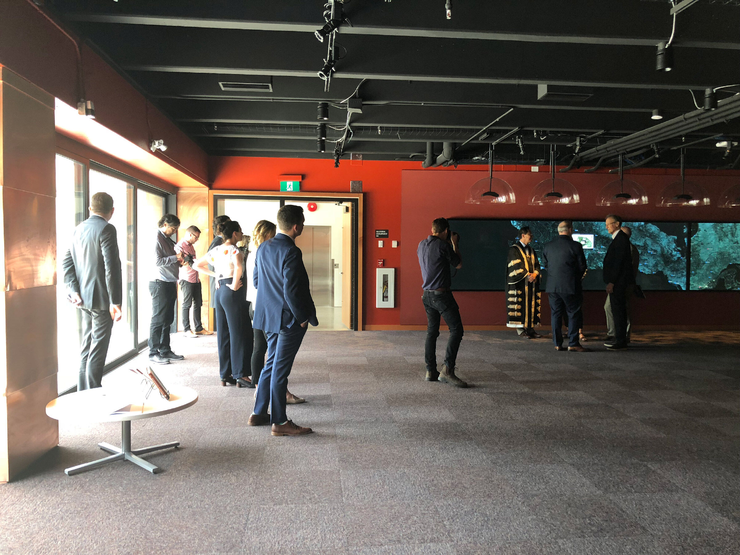
Visitors from the province and the university.
The outcome
Two awards, and still running.
Two Vancouver UX Awards in 2019: UX for Good, and People's Choice. Still running at the Centre, which calls it a starting point for viewing its digital materials.6 The gesture framework, the touch broadcaster and the wall itself are open source, for the next person who needs a Mac to work like an iPad.
3,527
public records in the Centre's collection. Every record on the wall comes from it.7
1,000+
people on opening day.1
2 of 8
wins at the 2019 Vancouver UX Awards. No entry won more.4
The film we sent the Vancouver UX Awards.
My take
The impressive part was never the technology.
It was what it did for the people standing at it. It's been an interface for people to learn more about the Indian residential school system, and it has done that really effectively for the people who have come to visit.
Questions? Answers.
-
How did the project start?
With a call from the Centre. A former professor referred us, the Centre interviewed us at our office, and we pitched in January 2017.1
-
Who was it for?
Survivors and their families, community members, students and educators, and the public. The space had to suit university classes, school groups and community visits.5
-
What ran it?
Three 4K touch screens and one iMac Pro. A Raspberry Pi behind each screen turned raw touches into packets, and Mac Gestures turned them into taps, pinches and drags.3
-
Is the code open?
The core parts are, stripped of private data: the wall, Mac Gestures, the touch broadcaster and three demo apps, at github.com/logicandform.
M/O.